Living Color

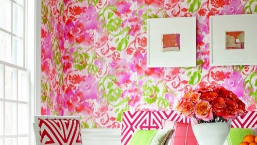
Bright pops of color with clean white is a favorite color for the spring and summer. Incorporated with pattern and texture it adds depth and dimension to a room. Photo by Thibaut. Wallcoverings available at Williamson’s Paint Store. Fabrics available at Drummond House.
By Gillian Drummond
The colors in our lives, the colors we wear, decorate our homes with and choose in the things we use in our daily life, have a powerful emotional impact and a meaning.
Hans Hoffman said, “The whole world, as we experience it visually, comes to us through the mystic realm of color. Our entire being is nourished by it.”
We are influenced by it in every area of our lives. It is used in all advertising and marketing campaigns to influence what we buy. In the 1940s, researcher Lois Checkin changed the color of a margarine companies packaging from white to yellow. This change improved the sales so dramatically that since then almost every brand of butter and margarine has been packaged in yellow. This change worked because we react to color both emotionally and physically.
Though each color has a prescribed impact on us, we also have our own likes and dislikes or preferences. This is something I always take into consideration when working with a client.
Red is the color of excitement, power and luck. It stimulates our bodies to pump adrenaline. Its effect helps people who wear it feel a sense of confidence and power. The interior designer Mark Hampton always said it should never be used in a bedroom, as it is too stimulating. It is a welcoming color for a front door.
Orange is a true stimulant to the brain. It is excites the emotions and can increase our appetites. It is a wonderful color for a restaurant, especially in its many hues, such as apricot, peach or tangerine. When I first lived in New York and was working for a design firm there was a very chic restaurant that I have never forgotten. It was in a very large plain room. They had painted it a gorgeous terra cotta and had a huge arrangement of fresh flowers in the center. It was stunning.
Yellow is a happy color because our brains secrete melatonin when we are surrounded by it. It also enhances our mental processes and clarity. I have always had a yellow living room; it is a happy, sunny place for me alone or to entertain in.
Green is the color of peace and renewal and is the most pervasive color in nature. Green balances and nourishes the soul. It is associated with love and beauty in many cultures. A green plant in a room gives the eye a place to rest and relax.
Blue is the most popular color, hands down. Men love it but it also appeals to women. It is the color of tranquility and rest, but also enhances creative tasks such as problem solving. Deep blue is used as a symbol of distinction and authority such as the oval shaped “Blue Room” in the White House which is used for receptions. I have had many clients through my career who loved blue and white together. When mixed with an accent color a blue and white room can be peaceful, with purple or green. It is stunning when used with red or yellow.
Violet and purple are the colors associated with royalty, magic, higher wisdom and courage. Purple also quiets the mind and is the perfect color for healing or meditation rooms. I have always loved purple flowers in my garden, mixed with all the greens nature provides and mixed with white and soft rosy colors. It is a peaceful haven.
I hope this brief overview of colors that impact our daily lives will help you create a happy home that is uniquely yours.
Gillian Drummond has her design studio, Drummond House, at the Down To Earth Home & Garden Center, 1080 S. Trade Street, Tryon, NC 28782. You can see her website at www.drummondhouseco.com and reach her at info@drummondhouseco.com or 828-859-9895.

