Color Inspirations for designs in the New Year
Published 10:00 pm Wednesday, December 28, 2016
Written by Gillian Drummond
The trend for 2017 is, to quote Iris Apfel, a multi generational style guru, 95, and one of my mentors when I was a young designer in New York, “More is more and less is a bore.”
The recession induced a minimal aesthetic, which is slowly turning into a need to express ourselves in a more personal and less trendy way. Global immigration, cultural flux, self-expression and soulful nostalgia are combining to redefine our sense of personal existence and a need to have a feeling of spirituality.
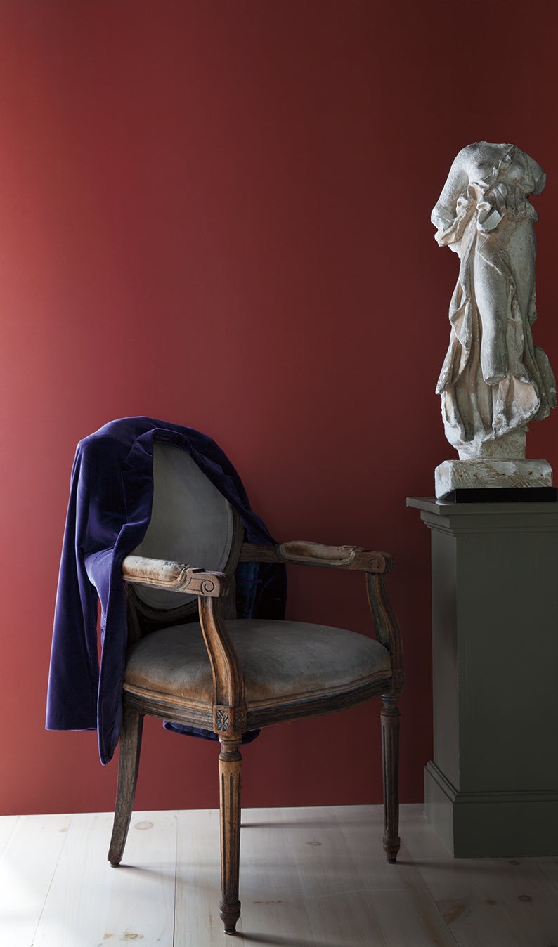
Benjamin Moore paint is available at Williamson’s Paint Center, Landrum S.C. The color on this wall is Dinner Party.
This need to express ourselves more personally brings into play a return to a richness of color consisting of pale, bright and deep, and the use of any style of furniture from antiques, vintage and modern, either used as a single statement or mixed for a more eclectic expression.
From the world of fashion comes a style full of pattern, textures and details with embellishments everywhere. Style goes from bohemian to grandeur – it is a sensual feast reminiscent of the Baroque era filled with vivid details of layered pattern, color, trim and texture. Color is everywhere and in many hues.
Benjamin Moore starts its 2017 color palette with a soft pink, Pink Bliss, which captures the delicate transparency of a bride’s veil. This sheerest of pinks is reminiscent of fresh flowers and wedding finery. This neutral hue conveys happiness and tranquility, and would be lovely in a bedroom but is neutral enough to bring light and warmth to a living room.
Jewel tones of blues, greens, and reds like Benjamin Moore’s Dinner Party, which is a sophisticated deep red with black undertones, are wonderful for a dining room.
In the really deep tones, Benjamin Moore has Gentlemen’s Gray. Formal and masculine, this blackened blue leans toward classic navy, suggesting beautifully tailored suits and traditional pea coats. I would use it in a library or a small bar and mix it with a Scottish tartan.
Their color of the year is Shadow. Elusive and enigmatic, it is a master of ambiance and plays into your spiritual mood.
“It ebbs and flows with its surroundings, and light brings it to life. Rich, royal amethyst can fade into the soft lilac-grey of distant mountains or morph into lustrous coal. Indulge your mysterious side. Let Shadow set the mood,” says Ellen O’Neill, Benjamin Moore’s creative director.
This color could be used in a bedroom, as it is very dramatic by day and yet spiritual and soft at night with the right lighting. I think it could also be used in a library or great room with great success when the right mix of other colors, textures or prints is used with it.
Gillian Drummond of Drummond House has opened her design atelier in downtown Tryon, N.C. View her website at www.drummondhouseco.com and reach her at info@drummondhouseco.com or call 828-859-9895.
More Country Living - Gillian Drummond
SportsPlus
How to Watch MLB Baseball on Friday, July 26: TV Channel, Live Streaming, Start Times
In a Friday MLB schedule that features a lot of thrilling contests, the Cleveland Guardians versus the Philadelphia…
How to Watch the Braves vs. Mets Game: Streaming & TV Channel Info for July 26
Travis d’Arnaud and the Atlanta Braves square off against Pete Alonso and the New York Mets at Citi…
Braves vs. Mets: Betting Preview for July 26
On Friday, July 26, Francisco Lindor’s New York Mets (54-48) host Marcell Ozuna’s Atlanta Braves (54-47) at Citi…
Atlanta Falcons vs. New York Giants Week 16 Tickets Available – Sunday, December 22 at Mercedes-Benz Stadium
On Sunday, December 22, 2024, the Atlanta Falcons (0-0) and the New York Giants (0-0) clash at Mercedes-Benz…
Carolina Panthers vs. Kansas City Chiefs Week 12 Tickets Available – Sunday, November 24 at Bank of America Stadium
Sunday, November 24, 2024 will see the Carolina Panthers (0-0) go on the road to meet the Kansas…
-
Polls
 Loading ...
-
-